31.5.12

& our wild paths intersect


Frank Bruggeman | Faye Toogood | Scholten & Baijings | Maarten Baas
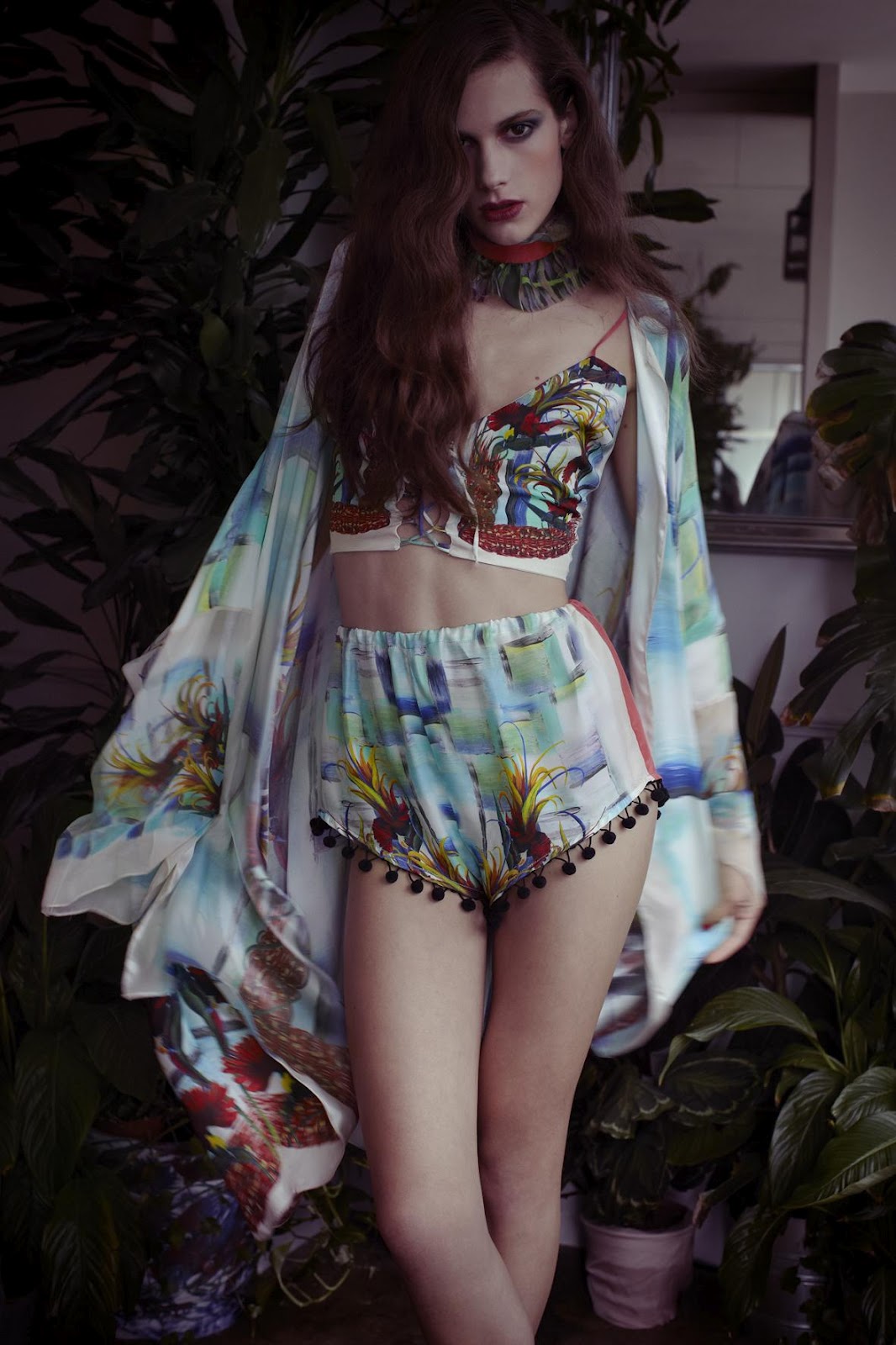
Photographed by Marius W Hansen
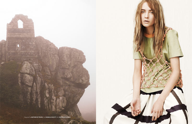
COS Magazine No. 10 - The Outside Issue

I was flicking through the latest COS Magazine, and was captivated by the feature that saw five noted designers and artists create a bouquet. Each interpreted in different ways, exploring various ideas; permanence, space, composition, representation, temporality, the urban outdoors...

My favourite is the floral arrangement by Frank Bruggeman - the form and composition, the contrast of textures, the simplicity, the way in which the one stem lies horizontally...

"His imposing installations shown in museums and public spaces often consist of trees, flowers and other organic materials. For this exuberant bouquet, Bruggeman combined dry, wintery materials such as chestnut branches with newly flowering amaryllis and tulips. “It gives one a sense of the season,” says the artist. “Bouquets are living rather than static things, and thus temporary.” Instead of choosing a traditional vase, Bruggeman has made use of a kenzan or ‘spiky frog’, a flower holder from the ikebana practice. A true flora fanatic, Bruggeman is a founding editor of Club Donny, a journal on the personal experience of nature in the urban environment."

Having a mother as a florist, I find myself becoming more and more interested in the construction and the concept of a floral arrangement, as so much of the deliberation over flower, colour and composition choices bear such a similarity to the creative processes when creating any other type of art. These pieces, in their expression of a concept with their sculptural appearance, prove that the artistry of arranging is far from a past time only the village elderly upkeep but a very contemporary creative practice that I believe is only beginning to permeate the art world.

--- title from a song by patten -- go listen -- & watching Drive for like the hundreth time -- the soundtrack is divine -- #midnightmusings

his lyrics blur like shoegaze slurs


Hermione de Paula ~ 'Darlingtonia's Obsession' S/S '12

~ With a poetic beauty reminiscent of a Pre-Raphaelite painting, Hermione de Paula's spring/summer 2012 collection is a natural progression from her previous work. Feminine silhouettes constructed out of gossamer-light fabrics are covered with intricate floral prints hand-drawn to look as if they have wrapped themselves around the designs. "Darlingtonia's Obsession", is an ode to the kingdom of plants, as illustrated by images of the Cobra Lily plant in the collection's prints. Meanwhile, the maxi and mini-dresses, suits and ensembles are evocative of bohemia chanelled via Brooke Shields during her Pretty Baby era.

De Paula has been dubbed the print prodigy of British fashion. Before launching her label in 2008, the Central Saint Martins alumnus cultivated her sensibility while working for John Galliano and Alexander McQueen. Having recently caught the imagination of a number of independent boutiques, from Tokyo to Riyadh, the Devon native has earned particular applause for her unconventional prints, which have been sported by singer Florence Welch, who embodies the spirit of the clothes.

So what next for the designer? After coveted collaborations with Nicholas Kirkwood and ASOS, de Paula is in the process of introducing a luxury element to her line via embellishments and embroideries. Given her unusual take on flora, there is little doubt these ethereal pieces will become equally sought after. ~

From Tank zine || text by Tania Al-Farouki

these smiling eyes are just a mirror for the sun


Created by Brooklyn based illustrator, Kaye Blegvad, Datter Industries jewellery is beautifully elegant, slender and minimal whilst retaining an organic aesthetic, offering the subtlest of gestures to the wearer, for example in my favourite pieces, 'The Watchful Eye Ring' & the 'Protective Hand Bangle'. 

"My illustration background means I tend to make pieces with a drawing-based process and a story behind them. I like things dark but elegant, and my jewellery covers some of the same themes I explore in my illustration work: ritual, the occult, war, weaponry, animals, talismans. I like things to show signs of being handmade: nothing too clean or too perfect."

Kaye's ETSY >>
...definitely purchasing some of these soon!

30.5.12

origami cosmos

b Magazine No. 4 & 5
design: Emily Hadden
first, fifth, seventh, eighth: Dempsey Stewart photographed by Tom Allen

15.5.12

psychology o'colourz


Johan Willner | Andrea Belag
Unknown | Kaari Upson
Mark Rothko, No. 3, 1967 | Hindu tantra devotees
Cy Twombly, Untitled, 1982 | Unknown


I go through phases where I become completely infatuated with certain colours / combinations. Don't know why or how but it happens & lately it's pink & red. Clashing and with the age old stigma that they should never be seen or or worn together, there is actually something vivid and luscious in their combination. Need to find a colour block or painterly silk dress with these colours on...

14.5.12

cactus on the dashboard


New arrivals from Where I Was From
Adore these photos; makes me want to don the linen // white cotton dresses, chunky jewellery & sandals and run around meadows and woods in the sunshine. 
Soon...

6.5.12

time trapped within an image


You know that feeling when you suddenly get totally overwhelmingly excited about something in a moment and you literally don't know how to articulate it? That's me right now. I was embarking on my nightly trawl through art tumblrs & lo and freaking behold, I stumble across the work of David Gilbert, an artist and photographer based in LA.
His work wholly sums up my life right now; after a week of minimal sleep / couple of all nighters I am awake in some kind of messy daze - my room's a mess, I look a mess, everything around me is generally just unkempt yet you get to this point & although you know everything's a bit fucked up, it all seems so simultaneously beautiful. The stream of clothes crawling out of the suitcase I'm living from turn into something with perfect composition, as if it were staged. The tumbling piles of books, papers, receipts, letters, zines left unattended for so long (I'm at home home not landan home) are not a nuisance to have to sort but a vivid array of faded pastel coloured corners and jutting edges. The wilting flowers three weeks passed & the desk strewn with jewellery hastily grabbed on my last leave to london are the things I want to photograph. This messy daze is at once something beautiful.

This is exactly why I love Gilbert's work.
While looking through his oeuvre, it is hard to figure out the actual medium of the final pieces; installations? still lives? sculptures? photographs? performance pieces? works in progress? His work exists as a fluid mixture throughout all of these mediums. Ideas concerning permanence permeate Gilbert's works. He uses photography to document moments of the perpetual constructions he assembles out of debris lying about the studio where blankets, papers, eggshells, fabric, plastic, rope as well as equipment such as scissors & objects such as a single shoe, otherwise overlooked and discarded, now become the subject of a vivid almost garish, but beautifully intricate photograph, forever immortalised. There has always been something romantic about entering the atelier of an artist; where the creative processes take place in their rawest forms, always changing and developing & I love how Gilbert plays with the temporality of these moments & his real consciousness of how the most mundane and disposable can become the most beautiful.

"David Gilbert's installations of photography and sculpture are an effort to pin down ephemeral forms, creating a dialogue between image and actuality. Gilbert’s studio practice begins by working with humble materials such as fabric, clothing, paper, cardboard, paint, and yarn. The resulting messy, fragile, and often whimsical assemblages are arranged within the studio environment as still-life compositions or theatrical vignettes. Gilbert often photographs these arrangements with a 4x5 camera under chiaroscuro lighting conditions and presents the resulting images as large-scale prints. Through this re-representation, Gilbert exposes the photographic medium’s transformative potential, elevating and dignifying the scrappy sculptures into the realm of portraiture. With a nod to painters such as Ingres and Vermeer, and photographers Robert Mapplethorpe and Peter Hujar, these “portraits” generate a conceptual fetishization of their subjects. The work operates between abstraction and vérité, where the viewer recognizes the materials from which the sculptures are made, but the resulting forms are ambiguous, ghostly or crude figurations." ~ Klaus Gallery

Gilbert's Tumblr >>

5.5.12

& >


Interesting works from cock-tails blog: 


'A WORK OF FORMAL ART, PRIMARILY IN THE VISUAL ARTS, MADE FROM AN ASSEMBLAGE OF DIFFERENT FORMS, THUS CREATING A NEW WHOLE'


& check out oko-kolektyw (polish for 'eye-collective' ) for some more interesting imagery & compositions, the author of which insists that they treat the blog as storage but nonetheless aims to have the posts work colour-wise.

...Consciously or unconsciously, I like the idea of placing two seemingly different images together which then once, as a whole, form new links and meanings. 
- + HOME